I've had a quick go at a Makeover Monday
You can see my attempt at analysing the 16 April 2018: Malaria incidence in southern Zambia dataset. (The link is to an nbviewer version of the page).
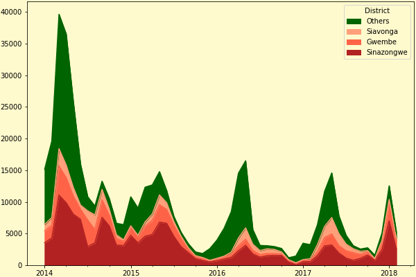
Here's a visualisation of the incidence of malaria. The provinces with the highest incidences are picked out; the others are bunched together.

As datasets go, it's not overly interesting with not much able to be drawn out of it. A large part of this is the limited scope of the data. There are raw numbers for reported cases, but we don't know anything about the underlying population the cases are drawn from. For instance, the district of Sinazongwe has a much higher incidence of cases than other districts. Is this because the health infrastructre there is lacking, or is it because that's just where most people live?
Despite the lack of abstract "data science" interest, it's very impressive as a representation of the improvements in public health and lives saved.
Data from VisualizeNoMalaria via Makeover Monday.