Most recent update:
As with many people, I've been looking at the Covid-19 data. I've analysed the number of deaths, as the number of reported cases is strongly influenced by the number of tests performed. These figures will be updated daily, as more data comes in.
Headlines
There have been deaths reported in the UK, up to .
Reported deaths, by country
This graph shows just the number of deaths reported in each country. It will be an under-estimate of the true impact of Covid-19, as many people who die from the disease will do so without a formal diagnosis.
This graph shows just the number of deaths reported in each country. The data is reported weekly, most recent update on . It will be an under-estimate of the true impact of Covid-19, as many people who die from the disease will do so without a formal diagnosis..

These are the deaths per week.

And the deaths in the past six weeks.

Deaths in the UK
The most recently-reported death and case numbers.
| Deaths reported so far | |
| Deaths in last 30 days | |
| Cases in last 30 days |
You can see the number of deaths and cases in total, and over the last 60 days.


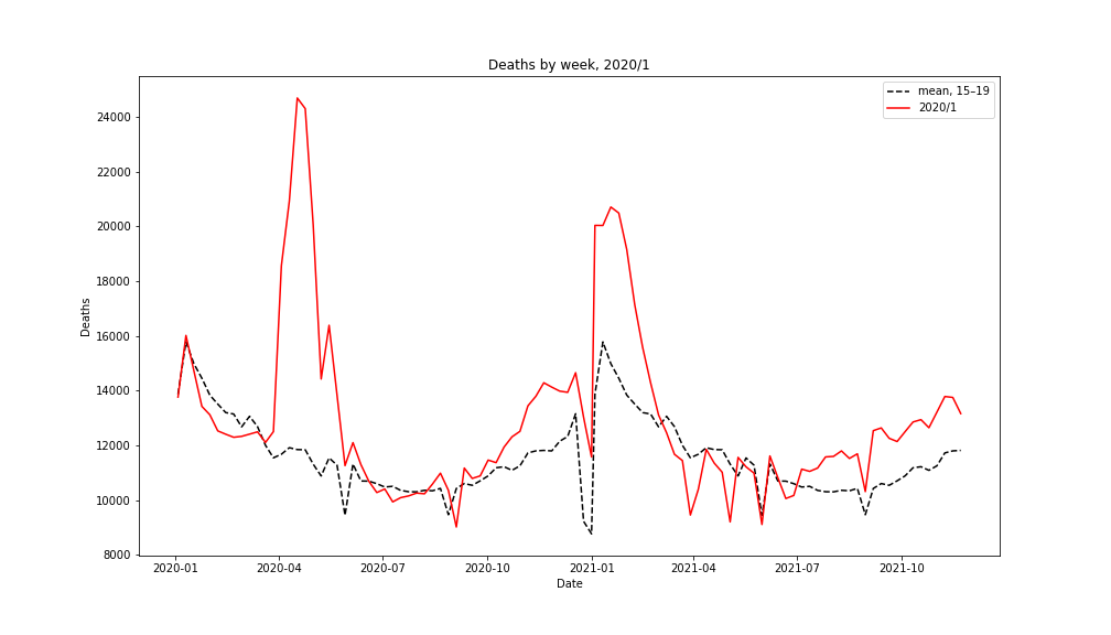
The chart below shows total deaths (of all causes) in 2020–1, compared to the average over the period 2015–9.

Hospital admissions
The number of deaths, new cases, and hospital admissions provide different views into the prevalence of Covid in the population. It seems that people are admitted to hospital about ten days after the onset of symptoms, and die fifteen days after admission (typical times for severe cases).

These are all given in arbitrary units, normalised to 1 on . This is because the numbers of cases, admissions, and deaths are all very different.
We can see the number of people in hospital, and the number on mechanical ventilators.

Testing effectiveness
Rising numbers of Covid cases could be because of increased prevalence of the disease, or just an increase in the number of tests being performed.

One way to tell the difference is to look at the fraction of tests that give positive results. If the fraction of positive tests increases, it indicates that the true number of cases is also increasing; if the fraction of positive tests decreases, it indicates that the testing is being applied more widely to a population with a non-increasing case load.

Another way of looking at the effectiveness of tests and Covid prevalence is to plot the number of tests done against the fraction that are positive.

Points higher indicate more tests; points to the right indicate more positive tests.More tests being done with the same infection prevelance will move the point up and to the left.

Sources
European data on deaths comes from the European Centre for Disease Prevention and Control.
Population data on excess deaths comes from:
- Office of National Statistics (Endland and Wales)
- Northern Ireland Statistics and Research Agency (Northern Ireland).
- National Records of Scotland (Scotland)
Hospital and testing data from the Gov.UK Coronavirus data portal.
You can download the source code that generated these figures.